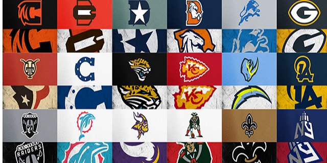
We’re a long way off from the NFL season but it’s that time of the year where we see fans take their shot at redesigning NFL team logos during the football down time.
Aspiring graphic design artist and U-W Madison graduate Mark Crosby took the time to redesign the logos of all 32 teams and the results for the most part are very impressive.
Take a look a see what you think. How does your favorite team’s redesign stack up?
Here are the logos with a brief description of the changes Mark decided to make.
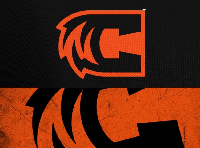
Cincinnati Bengals: I loathe teams that use nickname monograms instead of city/state/region monograms as their primary logo.
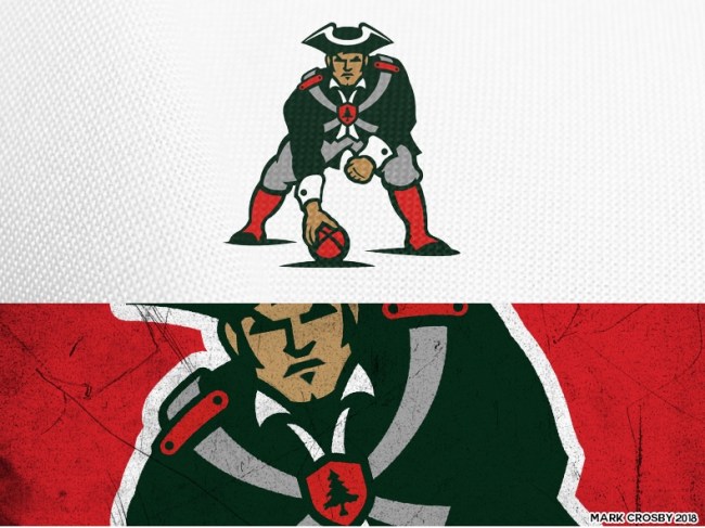
Mark Crosby
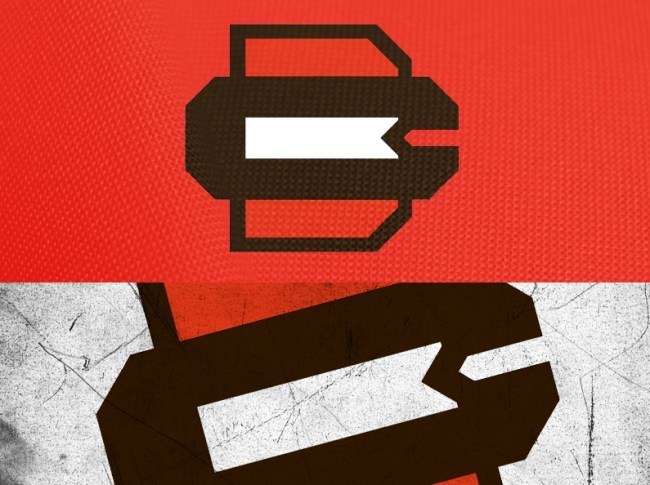
Cleveland Browns: Dog logos just aren’t working, but CB and a brown/white/brown stripe sure screams Browns to me.
Mark Crosby
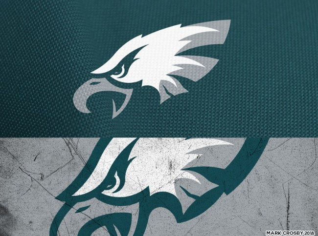
Philadelphia Eagles: Is that a Liberty Bell?
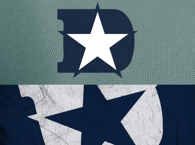
Dallas Cowboys: Let’s give Big D a D to be proud of.
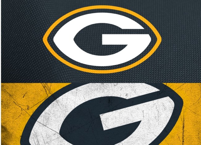
Green Bay Packers: I’m biased, but the Packers logo is perfect. This change cleans it up some and gives back the football points.
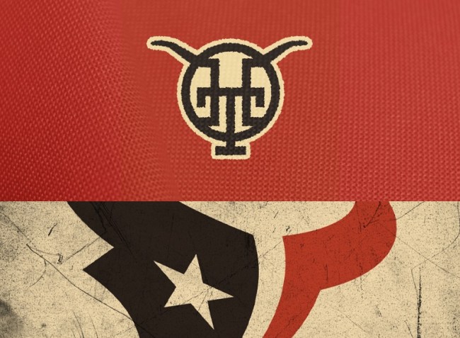
Houston Texans: The Texans logo is beautiful. The colors are overdone. In the spirit of a logo redesign for all teams I went with a cattle brand secondary.
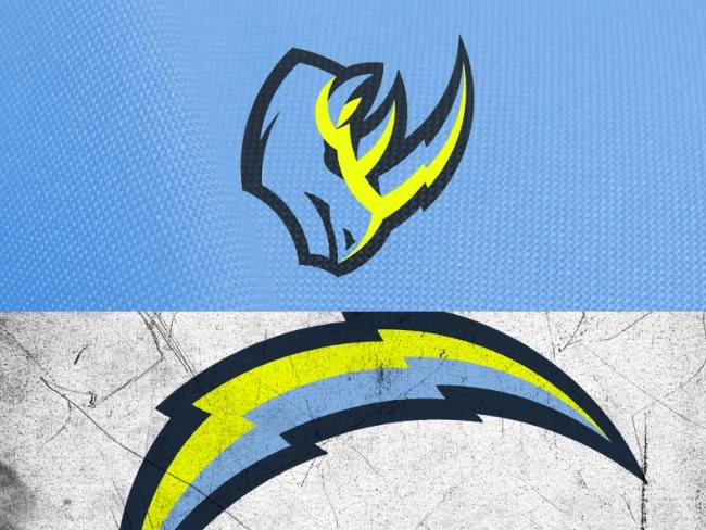
Los Angeles Chargers: Rhinos charge, rhinos are underrepresented in sports. The Bolts get volt.
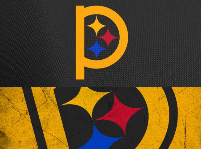
Pittsburgh Steelers: We know it’s the Steelers, it doesn’t need to be written in 12 pt font on the logo. How about a P for Pitt?
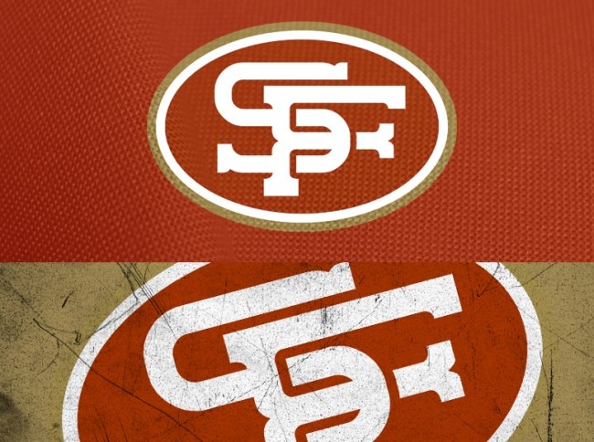
San Francisco 49ers: Those gold-diggers went West in 1849, shouldn’t the logo be a bit more Western?
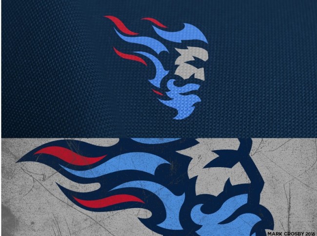
Tennessee Titans: A titan should have a beard, and flaming hair.
For the rest of the NFL teams make sure to check out Mark Crosby’s Behance page.