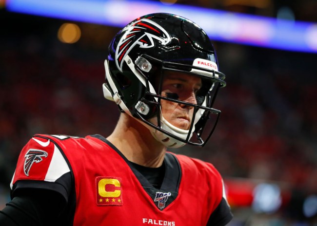
Getty Image
The Atlanta Falcons have a new look and most people don’t seem to be on board with it. The Falcons revealed their new uniforms along with an alternate ‘ATL’ logo on Wednesday morning and the reaction on Twitter has been far from positive.
Atlanta showed off four new jersey combos and while the all-white look and throwback black top aren’t entirely awful, the other two uniform combos are rough. It also looks like they took a page out of the Titans’ playbook electing for the silver/grey facemasks on the new helmet.
For our team.
Our fans.
⁰Our city. pic.twitter.com/15e5ZX6EtE— Atlanta Falcons (@AtlantaFalcons) April 8, 2020
Atlanta, this is for you. pic.twitter.com/VVwVrKznOp
— Atlanta Falcons (@AtlantaFalcons) April 8, 2020
A lot of folks shared the same initial reaction after seeing the new uniforms claiming that they look like something you’d see in the XFL or Arena League. The jersey that fades from black to red definitely does scream XFL as do the comically large numbers, I don’t think anyone can argue with that.
I’m not sure exactly when or why the NFL elected to put huge numbers in really shitty font on jerseys, but we need that to stop immediately. The Falcons, Buccaneers, Titans and Jags number-game is horrible.
https://twitter.com/chasemx76/status/1247872687109746688?s=20
https://twitter.com/GrandpaRamsaySr/status/1247872752305999873?s=20
https://twitter.com/jmgunz/status/1247872954203021318?s=20
This just in: The Atlanta Falcons have joined the XFL
— Andrew Williams (@A_Williams870) April 8, 2020
New XFL team? Hahahahahaha
— Billy Rose (@Billy_Rose3) April 8, 2020
Y’all had to go pretty far out of your way to mess up this badly. The arena league stripe, the XFL gradient, the comically oversized font and drop shadow in the year 2020. Embarrassing.
— Britton Thomas (@BrittonThomas) April 8, 2020
Looking very XFLish
— Melissa (@lissalyons29) April 8, 2020