Getty Image
Super Bowl 60 will soon be upon us. The New England Patriots will face off against the Seattle Seahawks in a rematch of Super Bowl XLIX.
That matchup occurred back in 2015. Things will look much different than they did a decade ago.
Both teams have new signal callers, moving on from household names in Tom Brady and Russell Wilson. The coaches are new, too.
Legends Bill Belichick and Pete Carroll are now working different gigs. Mike Vrabel and Mike Macdonald have filled their spots.
Interestingly enough, both are just starting their tenues with their respective organizations. Macdonald is in Year 2 while Vrabel made his debut this season. Clearly, they’ve done something right.
All of this goes to show that a lot has changed over the years. That not only goes for players and coaches, but for logos, too.
Where does Super Bowl 60 rank amongst best logos?
There have been 59 logos to come before. Each is unique in its own way. Some play on game location. Others cater to the AFC vs. NFC aspect of the contest. The newer editions feature the Lombardi trophy.
In most cases, the era is easy to identify, though results can be mixed when looking at different timelines.
Here, we’ll take a look at logos from Super Bowls past while placing the newest version amongst the Top 10.
10. Super Bowl XLIV
Getty Image
Game result: Saints 31, Colts 17 (2010)
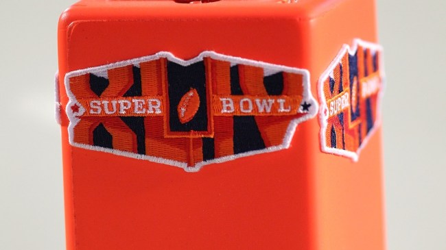
This design took a slight turn away from the typical red and blue color scheme often seen on Super Bowl logos. Instead, it featured an orange look with a dark blue background, likely a nod to the city of Miami where the game was played.
The football sailing through the uprights is unique and works well placed in between the block lettering and Roman numerals. Most notable of this edition is the fact that it’s the last of its kind.
A transition was made to more current designs. The following year’s logo featured the Lombardi trophy, a detail that’s been included every year since.
9. Super Bowl XXVIII
Getty Image
Game result: Cowboys 30, Bills 13 (1994)
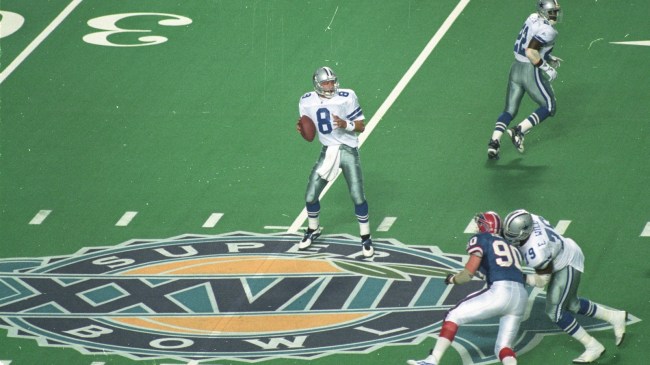
The ’93 championship contest took place in Atlanta, Georgia for the first time ever. Playing into that locale, the design used the Georgia Peach.
The Georgia Dome was then an annual host for the NCAA’s Peach Bowl, which featured a similar logo at the time the game was played.
It’s one of three college-themed designs, another of which you’ll see later on this list.
8. Super Bowl XL

Getty Image
Game result: TBD (2026)
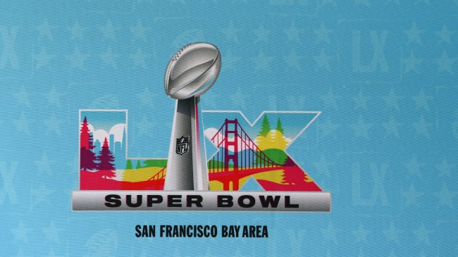
This year’s logo comes in at No. 8 on our list. It features many of the key design elements displayed in recent seasons.
The Lombardi trophy splits the Roman numeral lettering, which dons a background of the Bay area skyline in California where the game will be played.
This look has been used for each of the last five years, with cityscape pictured inside the numerals, but this most recent edition clears due to coloring and pop.
7. Super Bowl XXXVI
Getty Image
Game result: Patriots 20, Rams 17 (2002)
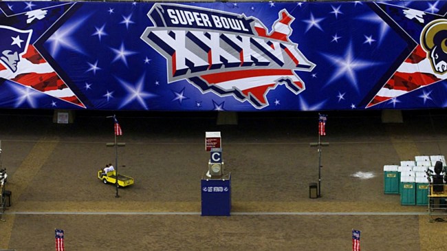
The most patriotic of the Super Bowl logos, the 2001 season paid respect after the attacks of the World Trade Center on September 11th.
Shown is a full outline of the US mainland with imagery of an American flag waving. The words “SUPER BOWL” take the place of the flag’s stars while Roman numerals are pictured atop the design.
The look was used to show unity and is one of the most unique in the game’s history.
6. Super Bowl 50
Getty Image
Game result: Broncos 24, Panthers 10 (2017)
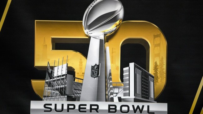
Super Bowl 50 has the only design to feature numbering as opposed to Roman numeral lettering. That made sense as a simple “L” likely would’ve looked out of place.
This edition also ventured away from the city location influence a bit and leaned into the gameday venue. An image of Levi’s Stadium in California is pictured around the outside of the Lombardi trophy.
While the venue is the main feature, the distant bridge and skyline shown in the “50” does provide a subtle nod to the Bay area.
5. Super Bowl XLII
Getty Image
Game result: Giants 17, Patriots 14 (2009)
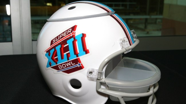
Held in Arizona for just the second time, Super Bowl XLII’s logo theme was heavily influenced by the Grand Canyon State. There is also an AFC vs. NFC vibe.
The stars, scheme, and outline of the logo each pay homage to the host city with state colors and flag nods. The red and blue coloring underlining “Super Bowl” separates the two conference champions.
While a number of past logos have represented the local area in some way or another, this appears to be the only one to have an actual state outline.
4. Super Bowl XXXIII
Getty Image
Game result: Broncos 34, Falcons 19 (1999)
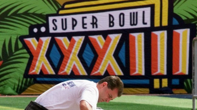
This Super Bowl design was creative, featuring bright colors that shied away from the tired and typical red and blue used often in the years prior.
Instead, bright yellow, orange, and sky blue were used alongside elongated Roman numerals and lettering. The color scheme featured the state colors of Florida as the game was played in Miami. It has a Miami Vice kind of feel.
This was part of what many consider the Golden Age of Super Bowl logos, which lasted from the early 1990s up through the mid-2000s.
3. Super Bowl XXXVIII
Getty Image
Game result: Patriots 32, Panthers 29 (2004)
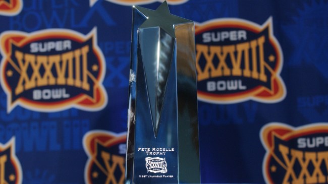
Another of the creative, city inspired logos, Super Bowl XXXVIII was a perfect representation of Houston. This was the second time the title game had been played in the city, but the first time in three decades.
The area has strong ties to NASA. This space theme played into that with the longest set of Roman numerals in Super Bowl history, written in yellow, laid out across a navy-blue oval with an orbit around it.
The color scheme is similar to that of the hometown Houston Astros.
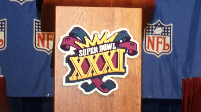
2. Super Bowl XXXI
Getty Image
Game result: Packers 35, Patriots 21 (1997)
Looking at the Super Bowl XXXI logo, you know instantly that the game was played in New Orleans. The Mardi Gras theme and coloring can’t be mistaken.
This was actually the eighth time in NFL history the title game had been hosted by the city, but it was one of the few logos to have that NOLA feel following Super Bowl XII, and arguably Super Bowl XV.
Super Bowl LIX would eventually follow suit to blend the city of New Orleans into the current logo design.
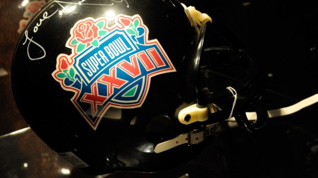
1. Super Bowl XXVII
Getty Image
Game Result: Cowboys 52, Bills 17 (1993)
Much like the Peach Bowl themed logo mentioned earlier on this list, the Super Bowl XXVII theme paid homage to the Rose Bowl for a game played in Pasadena, California.
It’s the perfect mix of NFL and college, with the classic red and blue coloring displaying Roman numerals across a Super Bowl shield. All of which sits atop a bouquet of roses.
This was the seventh time the Super Bowl was played in the area, a number that’s since grown to eight. Still, it’s one of just two logos to feature the Rose Bowl theme.