
Jim Walsh/Courier-Post / USA TODAY NETWORK via Imagn Images
Campbell’s Soup has wisely avoided making any changes to the fairly iconic red and white label it first adopted at the end of the 19th century. Most people have probably never put too much thought into the origins of that color scheme, but it turns out it can be traced back to a college football program that doesn’t have much else to brag about these days.
There aren’t many brands that encapsulate the essence of Americana quite like Campbell’s, the company that its namesake, Joseph A. Campbell, helped start in New Jersey in 1869 en route to building a canned goods empire.
Campbell’s has always peddled a variety of different goods, but it’s primarily associated with the soups that have historically defined the brand was immortalized in the series of 32 paintings that Andy Warhol composed in the 1960s to create the iconic pop art inspired by its lineup at the time.
The red and white labels that currently dominate an entire wall inside the Museum of Modern Art in New York City have remained largely unaltered since Campbell’s opted for a rebrand at the end of the 1800s, and it turns out they can be traced back to a college football team.
Cornell’s football uniforms served as the inspiration for the Campbell’s Soup label
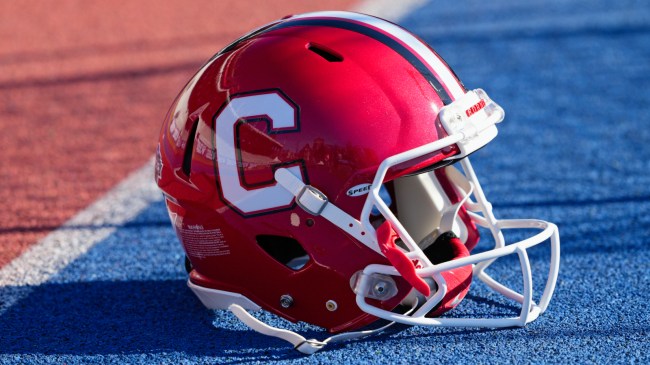
Getty Image
As is the case with every single member of the Ivy League, the football team at Cornell has become an afterthought in a landscape that has evolved a great deal since the days when the sport largely ran through the programs representing some of America’s finest learning institutions.
One of my favorite pieces of college football trivia is the fact that Yale still currently tops the list of teams with the most national championships at 18 (although their most recent one was earned in 1927), and the Big Red currently claim five of its own (the NCAA recognizes three in 1915, 1921, and 1922, although the first one is the only time they didn’t share a title).
Cornell may not be the force it once was on the gridiron, but it also has an interesting claim that only recently came to my attention thanks to the role it played in inspiring the redesign of the Campbell’s Soup labels that were initially orange and black and briefly white and gold prior to 1898.
Cornell headed to Philadelphia that year to face off against Penn on Thanksgiving, and Campbell’s general manager and treasurer Herberton L. Williams was in attendance to watch the Quakers secure a 12-6 victory in the early days of the rivalry.
As the company’s website notes, he was also struck by the “dynamic and easily identifiable red and white uniform” that Cornell donned during the showdown, and those colors were subsequently adopted for the label that has stood the test of time more than 125 years later.