via eBay
Hi everyone. Hope you’re having a great week.
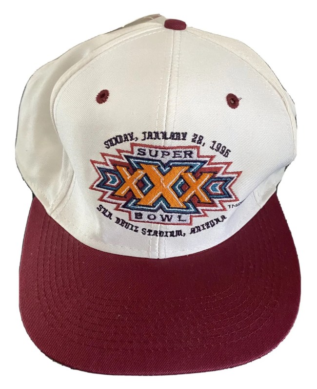
Brandon here, BroBible’s publisher. Today in the BroBible newsletter, 11 Things You Missed On The Internet, I went down a nostgalia-hole about the Super Bowl logos of yesteryear. What happened to actually cool Super Bowl logos that don’t cause us to break our brains? I
In the 1980s and 1990s, Super Bowl logos used to have a strong sense of place and identity around the Big Game. Now Super Bowl logo is about as exciting as a logo for a dentist office.
Super Bowl logos used to kick ass. Now they look like something that’s been through a dozen rounds of signs offs and approvals from key stakeholders pic.twitter.com/rNtAgkTzvA
— Garrett (@GarrettQuinn) January 29, 2024
Head on over to 11 Things You Missed On The Internet to read it. Thanks for subscribing and signing up. Just a reminder, our 11 Things You Missed On the Internet newsletter comes out 3x a week, on Monday, Wednesday, and Friday mornings and recaps some of the behind-the-scenes at BroBible, along with things you may have missed on this website.
We’d be very excited if you subscribed, which you can do right here.
*By signing up, you agree to our Privacy Policy and Terms of Service