Hannah Foslien/Getty Images
The Minnesota Timberwolves are 31-50, are in the basement of the Western Conference, and rank second to last in attendance (by capacity filled). They suck despite having appealing pieces like Karl Anthony Townes, Andrew Wiggins, Zach LaVine, and former NBA Coach of the Year Tom Thibodeau. Townes just broke the Timberwolves single season scoring record (2,011) set by Kevin Love back in 2013-2014. He’s also just 14 rebounds shy of 1,000 rebounds. For context, the last player to score 2,000 points and haul in 1,000 rebounds was Tim Duncan 15 years ago. It’s an absolutely travesty this team isn’t better than they are.
To distract themselves from an underwhelming season, the T-Wolves have replaced the logo they have employed since 1996 for one that more closely resembled “Old Shep,” the crowd favorite that was nixed for being a cliched representation of Minnesota’s “nice” ethos, focus groups reported.
Here’s Old Shep:
#Timberwolves old shep logo is far better than the current cartoon. Basic is the new cool #nba pic.twitter.com/rPSgkrOJKI
— The Sports Jesus (@thesportsjesus) April 12, 2017
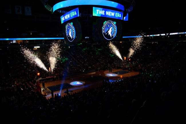
As part of a franchise rebirth, the Wolves will use the below logo for next year, as well as sport new uniforms and play in a newly renovated arena with a court that will be redesigned.
#Twolves unveil new team logo, which will be implemented beginning with the 2017-18 season. Full logo: pic.twitter.com/CTq17I4KOT
— Timberwolves PR (@Twolves_PR) April 12, 2017
Rodney Richardson, the designer of the new logo (as well as the logo creator of the Hornets, Grizzlies, Kings, Hawks, and Pelicans), said he toyed with many new designs before landing on the one above. According to ESPN, the designer considered “multiple wolves, multiple wolf heads, stylized triangular wolf heads that reminded Johnson of aliens, crazy colors, a wolf that stared directly at you, snarling wolves, and hunting wolves walking on all fours. They all seemed too garish, and too close to the over-animated schtick fans wanted gone.”
Just like a new haircut, it’s going to take some time for the NBA world to get used to the logo. Some aren’t so patient.
The new #twolves logo is a lot like the team: it's young and has lots of nice parts but you can't help wondering why it isn't better. pic.twitter.com/3SQUNd0qKi
— Eric Thompson (@eric_j_thompson) April 12, 2017
https://twitter.com/casspa/status/852228174029234178
The new Timberwolves logo is familiar… pic.twitter.com/gBWoWD8WD9
— hawkschronicle (@hawkschronicle) April 12, 2017
Talk about lacking creativity… pic.twitter.com/6RQKF16C1o
— Victor Owypipo🚶🏼 (@EightSix4bes) April 12, 2017
CONFIRMED by sources, here is one of the finalists for the @Timberwolves new logo. We'll see if it is unveiled tonight. @TWolvesRebrand #wow pic.twitter.com/er3HDucYa5
— Josh Theintern (@Theintern_josh) April 11, 2017
New #twolves logo…I'm not super excited. I like the original '89 logo better. pic.twitter.com/6Whu5uMiUe
— Stirrups Now! (@uniformcritic) April 12, 2017
[h/t ESPN]