Getty Image
On January 15, 1967, the Green Bay Packers and the Kansas City Chiefs faced off in what was marketed as the first-ever “AFL–NFL World Championship Game,” a showdown that saw the latter organization earning bragging rights after Vince Lombardi led his squad to a 35-10 victory.
As most football fans likely know, that inaugural championship is now referred to as “Super Bowl I,” the first in a long line of annual contests where the winner is now presented with a trophy named after the legendary head coach who would successfully defend the title the following season.
It’s safe to say the Super Bowl has come a very long way since then. The action on the gridiron is obviously the primary draw, but The Big Game has become the ultimate spectacle thanks to the star-studded halftime show and wildly expensive commercials that give even the most casual fans some incentive to tune in.
The NFL goes to great lengths to drum up excitement for its premiere event, and there was once a time when the league put a fair amount of effort into the logos it designs for every Super Bowl showdown.
Sadly, it’s hard to argue that’s still the case when you look at how they’ve evolved over the years.
How the NFL perfect (and ruined) the art of the Super Bowl Logo

Getty Image
Super Bowl II spawned the first “real” Super Bowl logo, and while that one and the others that were whipped up in the late 1960s and ’70s weren’t exactly complex or overly ornate, they were all still pretty beautiful in their simplicity thanks to a delightfully retro aesthetic (especially in regard to Super Bowl III and VII) that has largely managed to stand the test of time.
The NFL stepped up its game when the ’80s rolled around. The logo for Super Bowl XVII marked the start of a new era where the league incorporated its three primary colors into various designs, and that general approach would remain the norm for another decade.
However, things reached a brand new level in the 1990s.
The Golden Age of Super Bowl Logos
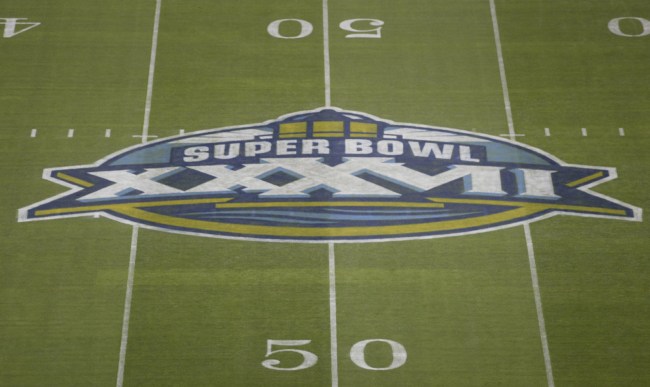
The Rose Bowl hosted the Bills and the Cowboys in Super Bowl XXVII in 1993, a year that sparked the beginning of a pretty cool trend that saw the NFL draw some inspiration from the venues and cities where The Big Game was held by incorporating references to those locations into the logo.
The league rode the Local Flora Wave the following year, as a peach was the centerpiece of the logo when the Super Bowl was played at the Georgia Dome.
Some people might assert some of those designs are painfully dated, but I’m not sure how you can’t at least appreciate the homage to Mardi Gras when the Super Bowl was played in New Orleans and the American flag-inspired emblem that was unveiled in the wake of the attack on 9/11
Unfortunately, things eventually took a turn for the worse.
The Sad Decline of Super Bowl Logos
I’d argue Super Bowl XL marked the beginning of the end thanks to the fairly uninspired insignia that was plastered all over Detriot when the Seahawks played the Lions.
If that was the death knell, then Super Bowl XLV was the moment the logos were officially pronounced D.O.A. thanks to the objectively awful decision to pivot to an incredibly generic design that the NFL would basically recycle with the slightest modifications for the next 11 years.
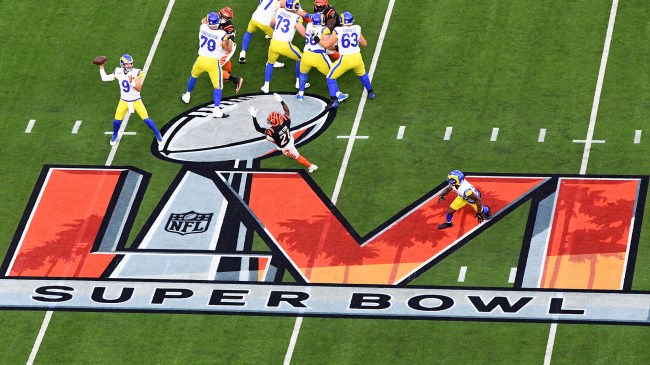
It does seem like the league realized the error of its ways prior to Super Bowl LVI, as it injected some SoCal-inspired flair into that logo in the form of some palm trees emblazoned over a sunset (that trend continued this year with a nod to the mesas of Arizona).
As a result, Super Bowl logos may be moving in the right direction after hitting rock bottom.
However, when you consider the NFL’s marketing department has shown a willingness to change, it’s pretty obvious there’s no better time than the present to take a big leap and treat fans to logos that will hopefully land with a much, much bigger splash.