Major League Baseball got its new season underway on Thursday, which ushered in a new era of uniform that are designed by Nike and produced by Fanatics. Although the Dodgers and Padres already played a pair of regular season games in Korea, Opening Day really took place this week.
It did not get off to a great start in terms of optics.
Not only were the vast majority of games stuck behind a paywall that prevented fans from enjoying games outside of their individual markets, the new uniforms had all kinds of issues. The trend continued from Spring Training into the regular season.
Fanatics is getting torched, again, even though it claims that Nike is primarily responsible for the change. Nike, too, is getting flambéed and deserves the brunt of the blame for because it dictates everything related to the jerseys, including specific materials and any design decisions or changes.
Whomever is at fault needs to get things figured out. There were a few glaring concerns.
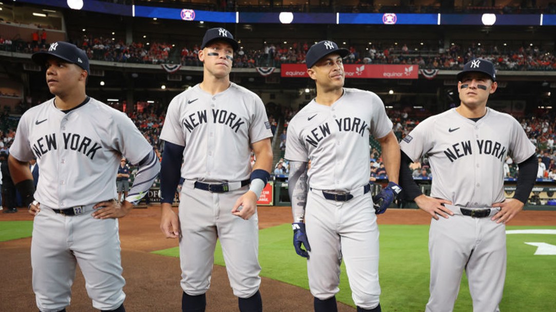
Major League Baseball’s new jerseys are bad.
First and foremost is the actual look itself. The lettering and numbers on the back of the jerseys are comically small.
There is plenty of room to increase the font size, as has been the case in the past.

They look cheap.

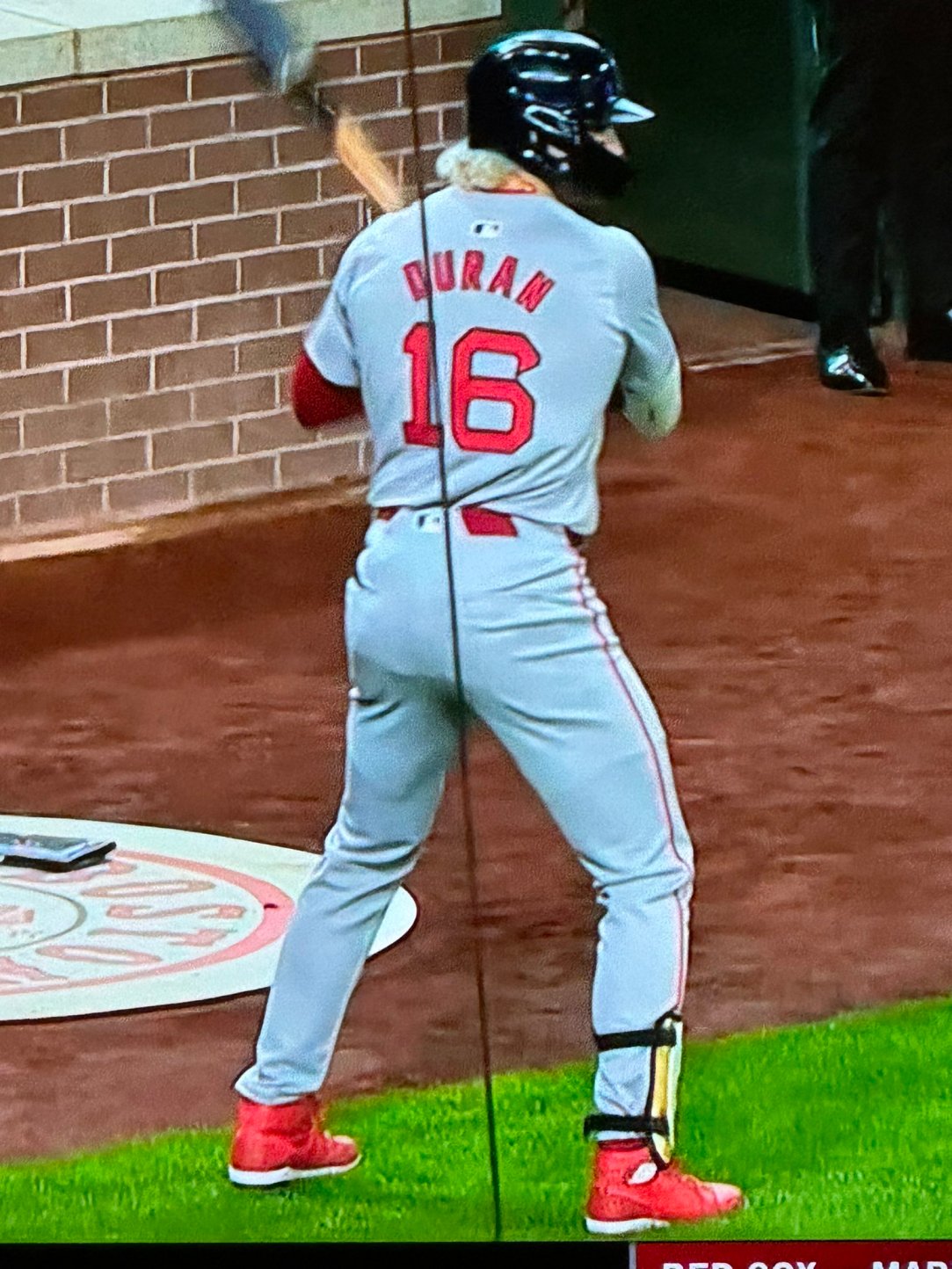
A large point of emphasis with the new MLB jerseys is the moisture-wicking fabric.
Nike tested a number of moisture-wicking fabrics, seeking something lighter in weight that would improve on-field performance. The following Spring Training, four or five clubs tested jerseys with different fabrics and different sleeve types, providing MLB and Nike with feedback along the way. A few clubs even tested out different jerseys late in the regular season after they had been eliminated, giving players an opportunity to test them out during workouts and bullpen sessions.
Using all of the feedback it had collected, Nike created a jersey that was well-received by players, complete with lighter fabric for the numbers, letters and patches – a necessity due to the performance-driven material and the thinner body of the uniform. Gone were the days of thick, embroidered letters, numbers and patches, replaced by sleeker and more efficient options.
— Major League Baseball
A sweat-wicking fabric has two jobs:
- Move the sweat from from body to the fabric’s outer surface.
- Dry rapidly so sweat does not saturate the fabric.
The jerseys seemingly failed their second purpose. Players were soaked with sweat.
They were drenched. Or, at the very least, the new jerseys made them look that way.
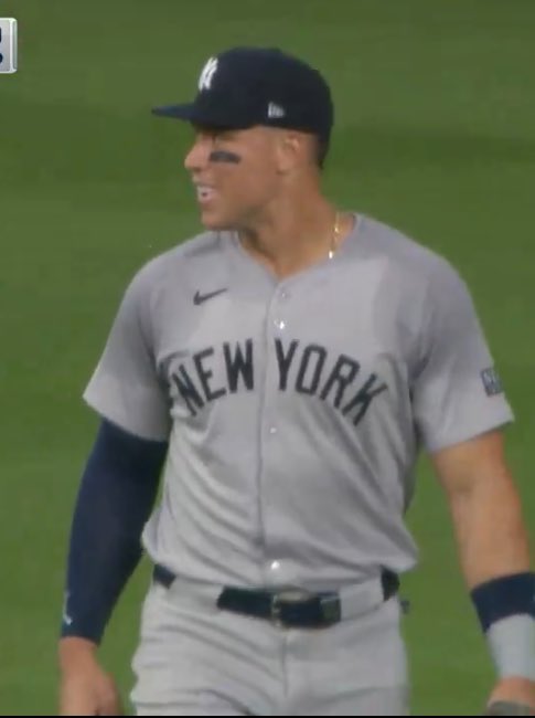
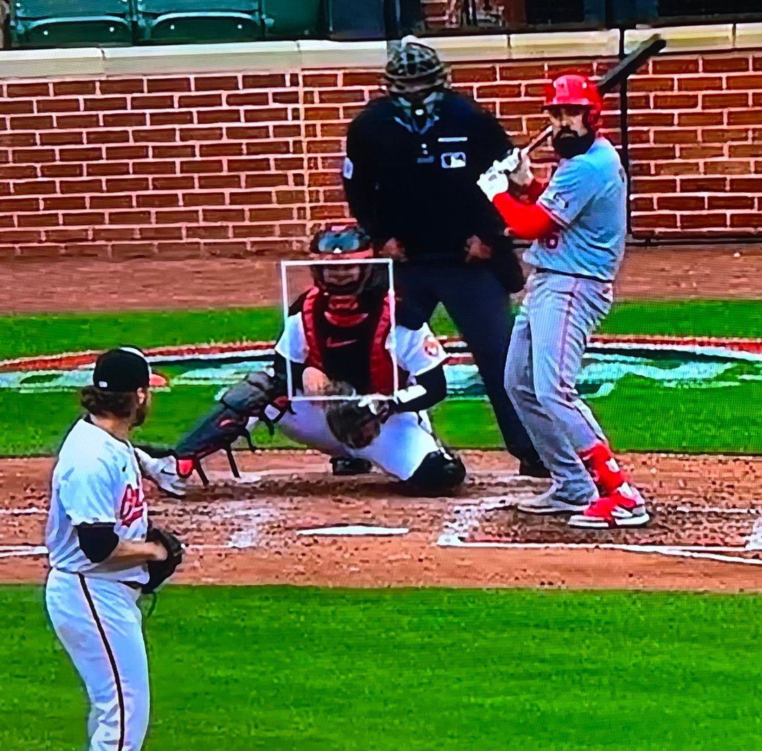
If that wasn’t bad enough, some of the uniforms didn’t even match!
The Los Angeles Angels’ grey jersey was a different color than its grey pants. It was two different shades.
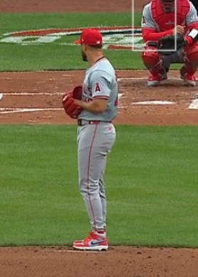
Their jerseys were lighter than the pants.
Here’s a better look:
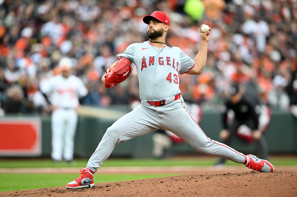
They’re slightly off. Just enough to be annoying.
All-in-all the rollout of the new MLB uniforms were a flop. The issues that very clearly came to exist during spring training carried into the regular season!