Vanderbilt University debuted a new logo in March of 2022. The Commodores launched a “refreshed visual identity” that made its ‘V’ look more modern.
It is an ugly self-inflicted wound.
They had something great that everybody could recognize. They turned it into something that most people is neither visually stimulating nor identifiable. Nothing good came from the rebrand.
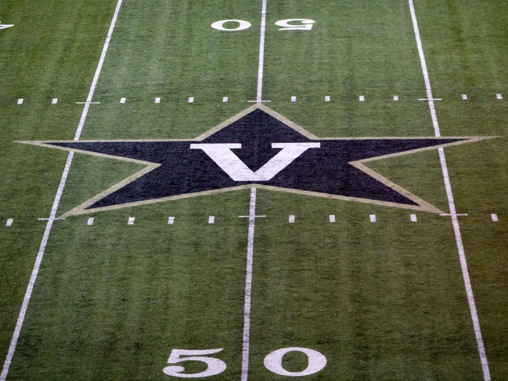
Here is how the iconic ‘Star V’ logo used to look:
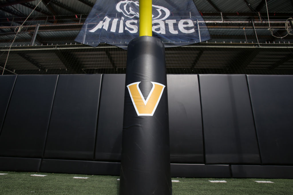
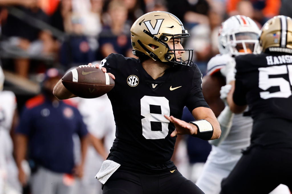
Here is how the new ‘Block V’ logo looks today:
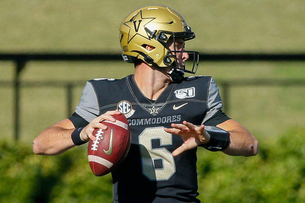
It looks even worse on a uniform!
Here is the Star V on a football helmet:
Here is the Block V:
Athletic director Candice Storey Lee was a key partner in the redesign. She had nothing but positive things to say when the change first became official.
From my perspective, the timing is perfect in that it illustrates the ‘new era’ that we have spoken of often. It’s a new day, with new energy, alignment and momentum to match. It’s another example of ‘Vandy United’ in action.
— Candice Storey Lee
With that being said, even Lee is willing to admit that the transition was rather jarring. Vanderbilt’s eighth-year AD recently joined ‘The Two Percent Podcast’ for a conversation with former Vandy Boys baseball players Kiambu Fentress, Harry Ray and Ro Coleman.
They asked her about the new logo. Lee, in a very roundabout way without explicitly stating her actual thoughts, admitted that there was some initial hesitation.
The way that she spoke around the ugly logo seems indicative of how she really feels.
You can read between the lines…
Lee never once praised the new logo. In fact, the Star V has been on her mind!
She presented a nonsensical world salad without any protein. Lee spoke in circles about what the new Block V logo represents and why the change is something that she would make again.
However, no tangible reasons were presented for why the new logo is better than the old logo in terms of visual appearance. Because it is not.
It is a shame that Vanderbilt made the change!