iStockphoto
For some reason, Kellogg’s decided that now would be the perfect time to completely redesign their iconic mascot for their Froot Loops cereal, Toucan Sam, and people are NOT having it.
Granted, there are far worse things for cereal lovers to be worrying about these days than Toucan Sam getting a new look. Like the fact that there are actually people out there who prefer putting water on their cereal instead of milk, but this change definitely struck a nerve.
Toucan Sam has been featured on boxes of Froot Loops since way back in 1963, and yes, he has seen a few cosmetic tweaks over the decades, so this isn’t the first time he’s gone under the, uh, pen.
Sam’s nose originally had two pink stripes until his beak was changed to reflect the three colors appearing in Froot Loops – red, orange, and yellow.
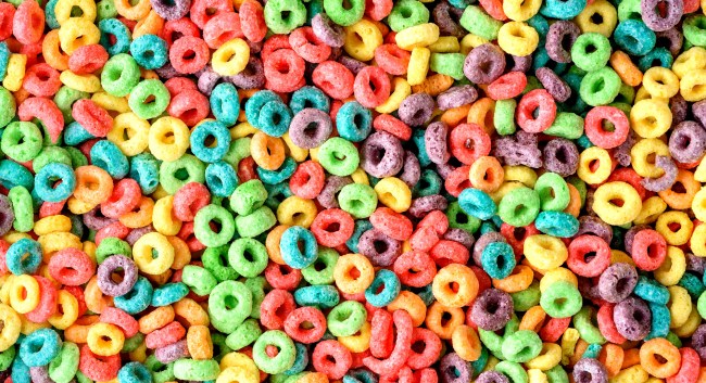
Now, however, with Kellogg’s going nuts with a whopping eight different colors showing up in Froot Loops, Toucan hasn’t been able to keep up. (They all still have the exact same flavor: wax.)
This is the way Sam has looked for about as long as most people who eat Froot Loops can remember…
https://www.instagram.com/p/BQva2rrjlPP/
And here is what he looks like today after Kellogg’s made some rather significant changes to his appearance this month…
https://www.instagram.com/p/B_8nDxKjKWz/
Wow, right?
Related: Ranking The Top 5 Cereals of All Time
Yeah, it’s not going well, at all, for Kellogg’s following this very controversial move.
I initially mistook the new Toucan Sam as a screenshot from some Gumball parody episode I assumed I had missed. pic.twitter.com/C0w3rcrw3C
— Carl, But 34 🎂 (@CarlDoonan) May 11, 2020
https://twitter.com/Nitomatta/status/1259929833015898112
but whyyyyyyyyy... 🤦♀️🤦♀️🤦♀️
— Bl@ckBettyBr@mbleJ@m (@BlckBettyBrmbl1) May 19, 2020
Toucan Sam is trippin'....
— ZyroFoxtrot🇺🇸⭐️🇺🇸⭐️🇺🇸⭐️🇺🇸 (@ZyroFoxtrot) May 19, 2020
My exact reaction when I saw Toucan Sam’s redesign 😭 pic.twitter.com/CW6HyKWDty
— J. Motoki (@J_Motoki) May 17, 2020
Can I ask what the hell happened to toucan Sam? pic.twitter.com/9dG8VDNxXB
— bobby (@chileanbob) May 18, 2020
Once again, as is always the case with company and/or sports team redesigns, fans did it better.
Tried my hand and re-designing that new Toucan Sam. Got rid of the awful human teeth, the solid black line-art, noodle wings, paws, and the over saturated colors. While still trying to stick with the modern chibi cartoon design.#art #ToucanSam pic.twitter.com/N8iOhKqTxN
— 𝙲𝙰𝙳𝙰𝚅𝙴𝚁 (@wingedwolf94) May 12, 2020
Okay, this is how I would redesign Toucan Sam based on this and his past iterations. One, don't use gradients, they look tacky and distracting. Two, I took from this design and his 1960s design giving a more defined shape that doesn't have the weird mouth pasted on. https://t.co/22getfVqS5 pic.twitter.com/GdPzlQMic0
— Yuki🌰 (@YukiGoomba) May 11, 2020
After seeing the Toucan Sam redesign & @bobjinx ‘s posts just analyzing it, I really just wanted to draw em! You know, for fun! pic.twitter.com/8gjMBOGkQI
— Melody Iza 🍉 (@Izaart) May 11, 2020
tried my own hand at a new toucan sam design…..
my main focus was improving the shape language and colors. i wanted something that looks friendly for both rigged and frame by frame animation.#illustration #characterart #mascot pic.twitter.com/UAczj6PJuO— spade 💖💜💙 (@spadearts) May 12, 2020
https://twitter.com/Edupatilla/status/1260007668791435265
wanted to take a stab at that new toucan sam look pic.twitter.com/Cikd1CG1Xf
— Triage🏬☀️🍉 (@tri4ge) May 11, 2020
My own Toucan Sam. #fruitloops pic.twitter.com/uHXIBlYk74
— Benji Campbell (@l8enji) May 12, 2020
Digitized Toucan Sam design from last night pic.twitter.com/Npfa0cfG3I
— Owen Fishback (@lotusfishicoot) May 13, 2020
Tried my hand and re-designing that new Toucan Sam. Got rid of the awful human teeth, the solid black line-art, noodle wings, paws, and the over saturated colors. While still trying to stick with the modern chibi cartoon design.#art #ToucanSam pic.twitter.com/N8iOhKqTxN
— 𝙲𝙰𝙳𝙰𝚅𝙴𝚁 (@wingedwolf94) May 12, 2020
Due to all the backlash Kellogg's received upon revealing their new design for 'Toucan Sam', they reached out to me to Redesign their redesign. very proud to work on such an iconic character🌈🥣 pic.twitter.com/TmprJW9qDZ
— 👍 (@fristdynamo) May 11, 2020
Okay, maybe not that last one.
Even kids know what’s up.
My kids just pointed this out to me...they said he looked “jacked up.” 🤣🤣🤣🤷🏼♀️
— BhawkMom (@bhawk_mom) May 19, 2020
Perhaps Kellogg’s should have just gone back to the OG design, huh?
i think we should just bring this toucan sam design back pic.twitter.com/SfcrSgZsqd
— ♫⃠〠 (@rotarydials) May 12, 2020
this whole toucan sam thing has taught me that i take cereal mascots for granted
— Squimpus (@squimpus) May 12, 2020
Indeed.