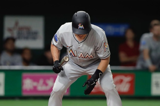
Kiyoshi Ota/Getty Images
The Miami Marlins identity crisis continues. For the third time in their 25 year existence, the franchise has changed their entire look–a new logo, new uniforms, and new colors for the 2019 season.
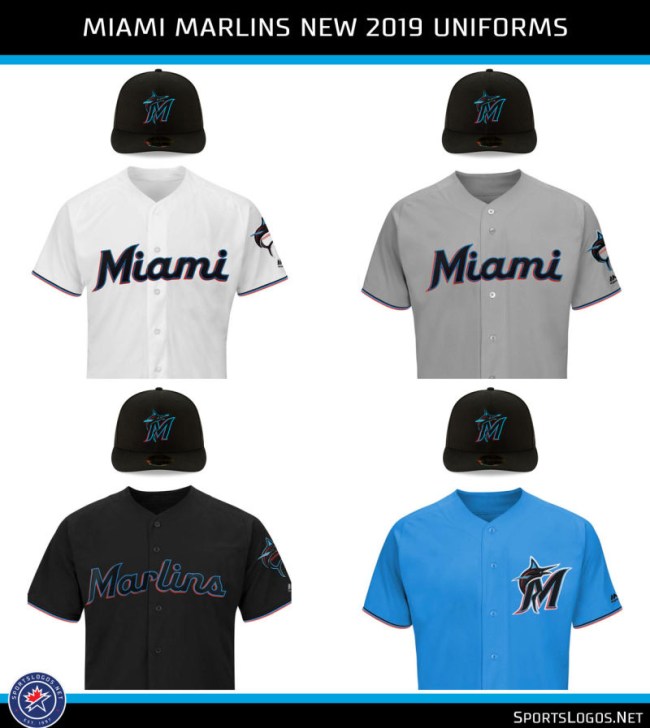
The new logo shows a marlin leaping in “Miami Blue”, “Caliente Red”, “Midnight Black” and “Slate Grey” imprinted over a stitching over a baseball. The typography of the “Miami Marlins” text is influenced by Latin-American flare. According to SportsLogos.net, the Marlins describe the logo as being “vibrant in ways that uniquely represent the Miami community” while it “embodies refinement and style, with a focus on looking forward – towards the future.”
Here’s your first look at the Miami Marlins new jerseys and cap. pic.twitter.com/1yUx3FezRO
— Miami Herald Sports (@HeraldSports) November 16, 2018
Here is the evolution of the Marlins logos over its 25-year existence, from its initial branding as ‘Florida Marlins’ to its re-branding in Miami over the past six years.
Via SportsLogos:
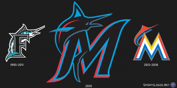
SportsLogos
SportsLogos
Miami #Marlins make it official, unveil their whole new logo set and colour scheme for 2019 #OurColores #MLB
Details, our post here: https://t.co/ebeqNCpV2L pic.twitter.com/Ms4eHaDO8o
— Chris Creamer | SportsLogos.Net (@sportslogosnet) November 15, 2018
Let’s check in with Twitter to see how they’re taking to the new look Marlins.
*sees new miami marlins logo*
me: pic.twitter.com/wiAPPlpcav— Jack #THWg (@jxsnktrx) November 14, 2018
https://twitter.com/holdmysporttake/status/1063182148247674880
https://twitter.com/jeauboux/status/1063187770867253248
Tight they can lose 100 games in style next year
— Jared (@_Frye_) November 15, 2018
I actually dig the Miami Vice vibe and full disclosure, there are some positive reviews of the logo/uniforms online, but THAT’S NOT WHAT GETS THE PEOPLE GOIN!