Getty Image
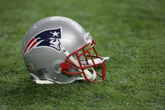
The New England Patriots have one of the most classic logos in all of sports. It’s clean. It’s simple. It represents what the franchise stands for. And, while it’s also one of the most hated because of the success the team has had over the past couple of decades, there’s no denying the logo stands for a brand that knows how to win.
But imagine if the Pats had something a little bit different, would it make any difference? In terms of success, probably not, but there’s that whole “look good, play good” thing that athletes often talk about, so who actually knows if the franchise would lose credibility if they look ridiculous and not be as accomplished.
Many of us only know the New England Patriots’ logo to be two things — the current one, and the classic “Pat the Patriot” design that resembles a patriot hiking a football. Both are great, but they almost didn’t even exist about 40 years ago.
In a recent story on Patriots.com by Angelique Fiske, the writer outlines the entire history of the Patriots’ logo over the years, and specifically mentions a 1979 contest that nearly saw the franchise go with a look that would’ve been embarrassing AF. Take a look at what could’ve been for the team below.
What if we told you there was a time this almost became the #Patriots logo?!
From @TheHall: How the flying Elvis came to be: https://t.co/gHKmQrSpGk
— New England Patriots (@Patriots) February 23, 2020
According to Fiske, when the logo was first presented to Patriot fans, they lost it, loudly booing the team at the old Schaefer Stadium when it popped up on the big screen. Yikes. Thankfully, the logo was rejected and the organization went in a different direction — but, with the recent reminder from Fiske, that didn’t stop some on social media to reminisce about the barf-worthy look the team once actually considered.
https://twitter.com/PhilipEarles/status/1231583431089369088?s=20
I was at the game in '79 when they voted on the new vs. old logos. It wasn't even close. LOL
— Gregory of Yardale (@buckyeffingdent) February 23, 2020
Bring these back permanently please pic.twitter.com/XEJiNNDV7P
— John Russo (@johndrusso73) February 23, 2020
— Sam ❤️💙🏈 (@Sunshineoflove1) February 23, 2020
That is a graphic design nightmare
— biblically accurate bruins fan (44-17-15) (@maddoxreksten) February 23, 2020
— Colette Godfrey (@ColetteGodfrey) February 23, 2020
Remember at the stadium when the crowd voted ABSOLUTELY NO to that and chanted "we want the old one"!!!
— DWilbur-3&88 (@DWilbur3) February 23, 2020
In addition to the awful proposed logo back then, remember that the Patriots also nearly moved to St. Louis in 1994, so, yes, the team did have its fair share of uncertainty — it just feels like forever ago.
It’s a good thing the New England Patriots listened to their fans and decided to go against whatever the hell that proposed logo was in 1979. Sure, it may have only lasted a few years before being changed again, but even seeing the players march out onto the gridiron with that look on their helmets would’ve been a permanent embarrassment. This is a friendly reminder that, when building a brand, never cut corners by going with the designer who still uses Clip Art.
(H/T NESN)