



iStockphoto // Laszlo Geczo/Kirby Lee/Greg Atkins-Imagn Images
Best and worst college football uniforms in Week 0.
Look good, play good. That’s the adage many college football programs cling to when making uniform decisions before kickoff.
In some cases, it works out. In others, on-field performance fails to match the pregame hype. We saw a few examples of each in Week 0 of the 2026 season.
There were eight games involving FBS programs this past Saturday, which officially kickstarted the new campaign. Of those 16 teams that competed, I’ve gathered my best and worst uniforms of the weekend.
Best, worst college football uniforms from Week 0.
The good certainly outweighed the bad on the opening day, highlighted by a pair of P4 programs playing across the pond.
I’ll start with my seven favorite combinations from Game 1 before noting one that missed the mark. Let’s dive in.
North Carolina Tar Heels
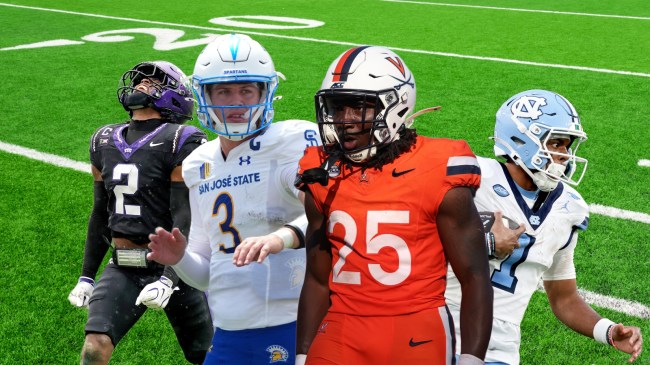
UNC went with an Ireland inspired throwback for its season opener against TCU. The Tar Heels didn’t disappoint, rocking retro white tops and Carolina blue pants.
On the helmet were the letters U-N-C in green, white, and orange, a nod to the national flag of Ireland. The jersey numbering is perfect. The hints of dark blue are made bolder on the white. I wouldn’t change a thing about the color scheme.
The Tar Heels caught eyes of the viewers with the classic look. They kept the spotlight with a 15-10 win over a fringe Top 25 opponent.
TCU Horned Frogs
Obviously, the final result of the game was disappointing as the Horned Frogs fell in a close opening matchup. The same cannot be said of the uniform combo. It was one of the best from the weekend.
TCU went with all-black jerseys and pants accompanied by purple caps. Those helmets had a shamrock in the mouth of the Horned Frog logo, a subtle yet notable salute to Ireland.
The uniform design was inspired by the school’s 2011 Rose Bowl team and also featured frogskin-patterned numbers. The little details helped put this one on top.
Jacksonville State Gamecocks
I’m a sucker for the icy whites. There is no look that’s cleaner, and Jacksonville State pulled off perfection in its season opener.
The Gamecocks brought back a retro helmet logo in 2025, which they donned on Saturday. It was previously worn by some of the earliest Gamecock teams in the 1950’s after the school changed its mascot from the Eagle Owls in 1947.
The Adidas jerseys are top notch from lettering to number size to stripe position. Unfortunately, Jacksonville State didn’t play as well as they looked. They were beaten soundly by North Dakota State, 33-7.
Memphis Tigers
Like I said, I’m a sucker for the all-whites, and Memphis’s were unmatched. The Nike fits were slick. The tiger stripes on the sleeves popped as did the classic ‘Block M’ logo design on the lids.
Unlike previously mentioned Jacksonville State Gamecocks, the Tigers showed out in their season opener. Memphis took down UNLV on the road in Game 1 to pick up a statement win. They looked good pulling the upset.
San Jose State Spartans
The Spartans didn’t go with the full whiteout in their debut vs. USC. The white tops and helmets, though, were clean which helped the blue bottoms flash.
Under Armour designed the San Jose State getups, and there are few better color schemes to work with in college football. Unfortunately, the look alone couldn’t propel SJSU to victory.
The Spartans fell to the Trojans in an empty Coliseum, 42-26.
Virginia Cavaliers
The Cavaliers opened their 2026 college football season with a bang, thrashing the ACC rival NC State Wolfpack 33-8. They did it in style, too. UVA rocked white helmets with all-orange uniforms in front of the home crowd.
The “orange-out” in Charlottesville wouldn’t have been possible without a late schedule change. This game was initially set to be played in Brazil. It moved to Virginia after plans fell through.
I won’t complain as it solidified the ‘Hoos’ decision to color rush.
New Mexico State Aggies
NMSU travelled to Tallahassee for its season opener. As a result, it wore white tops and white caps. The helmets boasted a script “State” logo with New Mexico lettering up top. That same design was seen on the team’s black bottoms.
My one complaint about the Under Armour uniforms is the team name across the front. I don’t love the NM State. I think I’d prefer just “State,” which they use on other jerseys, but it’s minor in the grand scheme of things.
Regardless, the Aggies looked good while hanging tough with Florida State.
My least favorite college football uniform from Week 0.
Eastern Michigan Eagles
EMU went with a blackout in its home opener. When done right, dark mode goes crazy. This one missed the mark.
I would’ve liked to have seen them either fully commit with black helmets or go with white domes for a little pop. The green lids just didn’t do it for me. There wasn’t enough color contrast.
I do love the Eastern Michigan lettering across the front of the Adidas jersey, but the rest just fell a little short. Others might disagree. Everyone is entitled to their own opinion.
Either way, the Eagles picked up a “W” where it mattered most by knocking off Sacramento State.