



iStockphoto / Stan Szeto/Brian Bishop/Darren Yamashita/Isaiah J. Downing/Michael Caterina (Imagn Images)
The best and worst uniforms from Week 1 of the 2026 college football season.
Our weekly college football uniform tracker is back after Week 1 of the 2026 season. Here, I’ll list the best and worst from the sport’s official kickoff on Labor Day weekend.
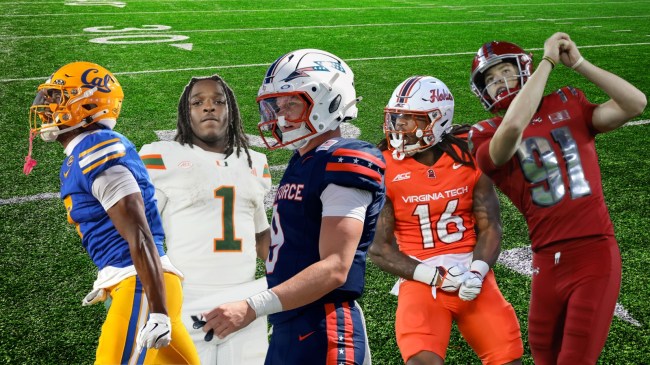
Look good, play good is the old adage many college football programs cling to when making uniform decisions. Eleven schools crushed it in their Week 1 matchups. Two others failed, at least in this fan’s eyes.
Week 0 provided a few fresh looks, though there were only a handful of games to choose from. The competition cranked up last Saturday and continued up through the Monday holiday.
Best and worst college football uniforms from Week 1.
The good always outweighs the bad, though one national spotlight game caught my attention for all the wrong reasons. I’ll start with my 11 favorite college football uniform combinations before capping with my two worst.
Typically, I’ll stick to FBS matchups, though if an FCS hits the nail on the head, I’ll give them a nod. This list contains only P4 and G6 schools. Let’s get started.
East Carolina Pirates
East Carolina kicked its season off in Tuscaloosa against the Alabama Crimson Tide. The game didn’t go their way, but they looked good, nonetheless.
The Pirates went icy white on the road, a look that I personally prefer to any other. They’re clean and simple, and the school colors pop on the white background.
ECU was whited out from head to toe with a classic script “Pirates” across the helmet. The purple and gold is one of the best color combos in the sport. Unfortunately, the jerseys didn’t provide much spark in a 48-10 loss.
Miami Hurricanes
More all-whites from Adidas, Miami showed up to Stanford in style. The Hurricanes looked sharp for their cross-country road trip to California, and their play reflected the attitude.
Miami won 45-6 over an ACC rival. It cemented itself as a national title contender and looked good doing so.
The design is simple, but it goes a long way. The “U” logo flashes on the domes while the green and orange striping and lettering pops on the white backdrop. Again, this is the best look in college football. I’ll die on that hill.
Air Force Falcons
Air Force honored the nation’s 250th birthday with a color rush for a matchup with Duquesne. It was not the only rushing the team did.
The Falcons ran roughshod over the Dukes to the tune of 431 yards. They won their season opener in shutout fashion, 34-0.
Air Force rocked white helmets on all-blue uniforms that were “set to the words of America the Beautiful, (and) inspired by the view from Pikes Peak.”
The American flag can be seen in the lightning bolt logo on the lids, a subtle nod to the 250-year milestone. It’s a look that’s impossible to hate.
Cal Bears
This was maybe my favorite look of the weekend. I’m a sucker for a throwback. Cal executed it perfectly in a loss to UCLA.
The blue and gold threads were a tribute to All-American QB Joe Roth, who battled melanoma before his passing at age 21 in 1977. His jersey remains the only to be retired by the school.
Cal, which typically wears a darker shade of blue, went lighter for the tops on Saturday. Jerseys were accompanied by gold pants and a stellar set of retro socks. The Bears also wore gold helmets with the Cal script.
Michigan Wolverines
Not much went right for Michigan in controversial one-point win over Western Michigan. The uniforms were not one of the issues.
The Wolverines went with an all-maize color rush from head to toe. The Jordan brand threads stood out, even if the team’s play didn’t.
Typically a traditional school when it comes to uniform choice, it was good to see the Wolverines go bold. After evading a season opening upset, we’ll see if Michigan returns to its roots for Week 2.
Utah State Aggies
Utah State went icy white for a matchup against Idaho State, but with a twist. The helmets featured a blue and white cow-print design.
The look was unveiled for “Ag Day,” and the school aptly promoted the reveal by dubbing itself “Mootah State.”
Interestingly enough, the look originated from an April Fools’ Day post in which the program publicized a series of mock-ups meant to be joke. The cow-print was met with overwhelmingly positive reviews, so much so that the domes were officially added to the alternative uniform rotation.
Virginia Tech Hokies
Virginia Tech ditched their maroon for an “Orange Effect” game vs. VMI. Similar to a look worn by rival Virginia in Week 0, the Hokies knocked it out of the park.
Fans were able to join in on the fun with a Lane Stadium orange out during a convincing 73-3 victory. There couldn’t have been a better start to the James Franklin era.
White helmets were the perfect accessory to the color rush, and they featured orange script lettering to spell out Hokies. Virginia Tech will be back at home in Week 2. We’ll see if their next look is equally as bold.
Oregon Ducks
Oregon is known for its alternative uniform combinations. They boast some of the best in college football. That was again the case for the season opener against Boise State.
The Ducks went with yellow lids and bottoms accompanied by green jerseys. The oversized duck head on the sleeve is my favorite touch.
Oregon was battle-tested by the Broncos, emerging with a 34-27 win. They looked good while squeaking out the victory and should find themselves listed often in future uniform rankings.
West Virginia Mountaineers
The Mountaineers played at home on Saturday in their season opener. That did not stop them from rocking all-white uniforms in Morgantown.
West Virginia hit my two favorite designs in Week 1 – icy and retro. They were spectacular and the perfect nod to legendary quarterback Pat White, who had his jersey retired before the game.
The program knocked the throwbacks out of the park with the state outline logo on the helmets being my favorite aspect. The Mountaineers even succeeded in drawing attention away from the gaudy green Monster Energy logo forced upon them by the Big 12.
SMU Mustangs
Another all-white look highlighted by classic branding, SMU nailed its season opening uniform choice for a matchup at Florida State.
The blue and red color combo is unmatched. The lettering is simple but in your face. The thin numbering is fantastic.
Fans had to stay up late on Monday night in order to see the jerseys thanks to a pregame power surge in Tallahassee. It was worth the wait!
Old Dominion Monarchs
I’ll admit there was a lot going on with these all-blue camo threads. I might’ve liked to see some white to offset the busyness, but all-in-all, they deserve a spot on the list.
The Week 1 uniforms were designed to honor the life and legacy of Lt. Col. Brandon A. Shah, a school alum and professor who died in a shooting at an ROTC class on campus in March. The words “LTC Shah” were written across the back of the jerseys in lieu of traditional name plates.
Old Dominion didn’t disappoint. They won their opener 31-10 over Norfolk State.
The 2 worst college football uniforms of Week 1.
With the good comes the bad. These were my two least favorite designs of college football’s opening weekend. They just so happened to come from the same game.
Wisconsin Badgers
I love the traditional Wisconsin uniforms, so it pains me to put them on the list of “worsts.” This all-red combo just didn’t do it for me.
A three-stripe sleeve design was inspired by the Packers as the game was played at Lambeau Field. The metallic numbering was a nod to the Lombardi trophy. Wisconsin’s history with the Rose Bowl was seen in the rosy, red jerseys and helmets.
For me, it missed the mark. I’d dub these the worst of the weekend with the Badgers’ opponent coming in a close second.
Notre Dame Fighting Irish
There were some aspects of the “Acme Packers” throwback uniforms that I liked, most notably the tiny shamrocks lining the jersey necks and the classic gold domes. Most everything else fell short.
Notre Dame went with a deep blue hue for both the shirts and pants. I wasn’t a huge fan of the oversized blocky numbers.
Like Wisconsin, the Under Armour designs were inspired by the Green Bay Packers given the location of the game. I much prefer the traditional Irish look.